A brand new look
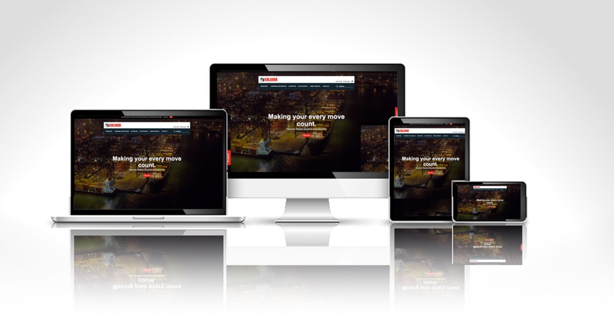
Welcome to Kalmar’s new and improved website.
The website is Kalmar’s most important digital channel of customer experience, and as you may have already noticed, it now has a new, sharp design and structure.
“We at Kalmar want to provide our customers with the best possible service and support -- online and offline. The aim of this project has been to improve customer engagement and interaction on our website through easy navigation, a simplified menu and design, and more customer focused content,” says Maija Eklöf, VP Marketing and Communication at Kalmar.
“With this facelift, we also wanted to move in the direction of a more modern customer and solutions centred structure on the site,” says Jenni Laine, Senior Manager, Marketing Operations and the project lead at Kalmar.
The previous setup originated partly from 2013, and on the Internet, seven years is an eternity.
“Naturally, the site has evolved since 2013, and it will continue to be a work in progress. This project is just another step in that evolution,” Laine says.
She characterises the re-launch of the site as a “facelift” because notably the redesign concentrates on the look and feel of it, along with navigation and usability.
“We were pleased with the underlying technology and our content management system, but we also recognised the need for a design update and upgrade of the functionalities and processes related to the site.”
What’s new
Visitors will notice the change as soon as the page loads. They will see the video background on the home page, the new navigation, the new mosaique menus, and in the sidebar, the new pop-up contact us form that will provide the opportunity to contact Kalmar on any given page.
“We wanted to create a home page that’s consistent with Kalmar’s customer promise of making your every move count. With the moving background images we can now show visitors what we do,” Laine says.
Kalmar has responded to customer feedback by offering the visitors two alternative navigation options to find the path to the correct page: a traditional top-down list menu and a more visualised one utilising highlighted blocks.
The updated site contains new landing pages with content focusing on different customer segments where Kalmar operates, including Ports & Terminals, Intermodal terminals, Distribution, Metal and Forestry industries. In addition, the new website has a dedicated section for eco-efficiency.
“Over the years, we’ve added a lot of content on the site and with almost twenty local sites, the level of web service has also differed from region to region. The facelift gave us an opportunity to streamline our web communication,” Laine explains. Kalmar will now have ten main geographical sites and eight country sites that offer a more focused content and service.
This relaunch also marks the beginning of further digital marketing developments where Kalmar will focus on continuous analytics, SEO work and the web-to-lead process, to make the most and the best of the new homepage.
“Since the website is an important digital gateway for communications between Kalmar and its current – and future – customers, it is also important that the new site can better enable interaction and faster response times to customer inquiries,” says Eklöf.
Feedback welcomed
The project began almost a year ago, with the last six months being the most intense building of the site, but as Laine says the work continues. One area of development will be personalisation of the website.
However, for now, the team can enjoy the re-launch, and further evaluate future needs.
“I’m very proud of the team’s work, and we’re all very excited to hear what our customers think of it,” Laine says.
Related articles
Subscribe and receive updates in your email
Abonneer je voor onze publicaties

